About Cheleq Chai
Web of Life mosaic
Cheleq Chai – a living piece.
In Hebrew, cheleq means a ‘piece’ or ‘portion’ and chai means ‘living’ – ch is pronounced as a guttural ‘h’, as in Scottish loch, and is transliterated from the Hebrew letter chet. Chet carries the numerical value of 8. Each Hebrew letter has a numerical value and this scheme of numerology is called gematria. In gematria, cheleq has a value of 138 and chai has a value of 18, so cheleq chai has a total value of 156.
Why this name, ‘a living piece’?
My artwork began with making mosaics out of glass tesserae: pieces of glass which I cut by hand and glued onto the design that I had drawn on paper. Mosaic work involves two key elements, tesserae and grout. The tesserae are grouted together, and therefore the grout is a uniting factor. I was attracted to the medium of mosaics in the first place partly because of the vibrant colours of the glass and partly because of the grout factor. It is possible to stick the tesserae in such a way that, when grouted together, the tesserae create their own semblance of movement. The lines of tesserae thus have a flow and an energy which is compelling, thanks to the grout.
Vivid Colours
The colours of the glass tiles were the other attraction for me. In my eyes, colour corresponds to the essence of life. Every hue and shade has its own quality. Linking colours together in a harmonious design is an exciting, enthralling process. Colours are like people with different personalities, and colours are enhanced by the company of other colours. A colour makes more impact by being next to another colour since the quality of each colour is exposed by the contrasts between its surrounding colours.
In the Torah, in the Book of Genesis (Bereishit in Hebrew), we have this beautiful image of the rainbow in the story of Noah. The Almighty gave the rainbow as a sign of His pledge to humanity that He would never again destroy the world by a flood. The bow of seven hues He gave in remembrance of His everlasting covenant with all living creatures on earth: His commitment to this living world which He created (Genesis 9: 12-17). We know from physics that by splitting white light we see the rainbow as the seven colours of the spectrum: red, orange, yellow, green, blue, indigo and violet. Each colour is distinct, yet forms its part of overall white light.
In mosaics using vitreous glass tiles, the colours are baked into the glass and are therefore permanent; they do not fade. The entire mosaic is something substantial and enduring, and this quality of durability also appealed to me. The craft of mosaic-making is a very physical process, requiring me to use a knife, ruler, pencil and steel probe; paper, glue and tile nippers; MDF boards, sealer, grout, adhesive, ceramic glaze, brushes, paint, sponges – and lots of water! The tesserae, which I cut with tile nippers, are the Cheleq of Cheleq Chai.
Ceramic glaze I found to be hugely important in highlighting the rich hues of the glass. I painted clear ceramic glaze onto the finished piece of work and it gave the mosaic a liquid look. Just as pebbles in water appear to glow, so the colours in my mosaics stand out due to the application of the glaze. The glaze also helped to protect the mosaics and to make them smooth to the touch.
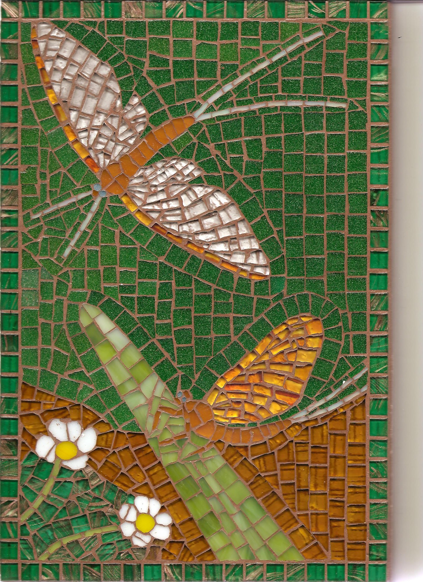
Along with ceramic glaze, I developed another ‘trick’ to enhance the colours in my mosaics: I dabbed white gloss paint all over the glass before I grouted it. As I made mosaics by the indirect method, whereby the mosaic is reversed upon mounting, the white paint ended up behind the glass. This was important because grout tones down the colours of the glass and can even make the glass look ‘dirty’. Pale grout has less of a dirtying effect, but pale grout also tends to make the tesserae look more separate; where small tesserae are used, there is the danger of the mosaic looking fragmented with pale grout. All glass tiles are to some extent translucent and the ‘dirtying’ effect of the grout is especially noticeable with transparent and pale-toned glass. It can be very frustrating to see the bright glass look dull after mounting, but the white paint avoided this problem – as demonstrated in the Dragonfly mirror here.
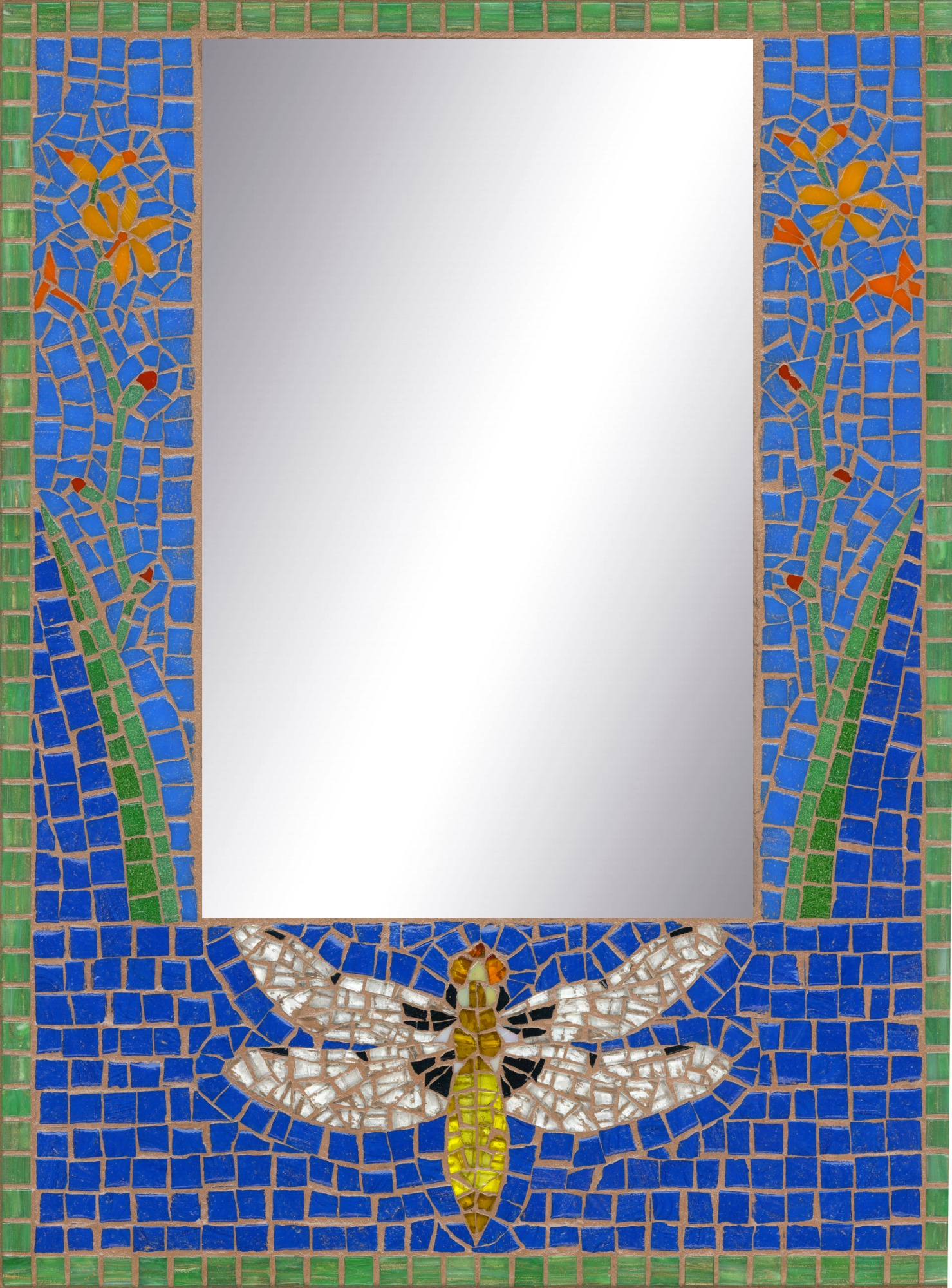
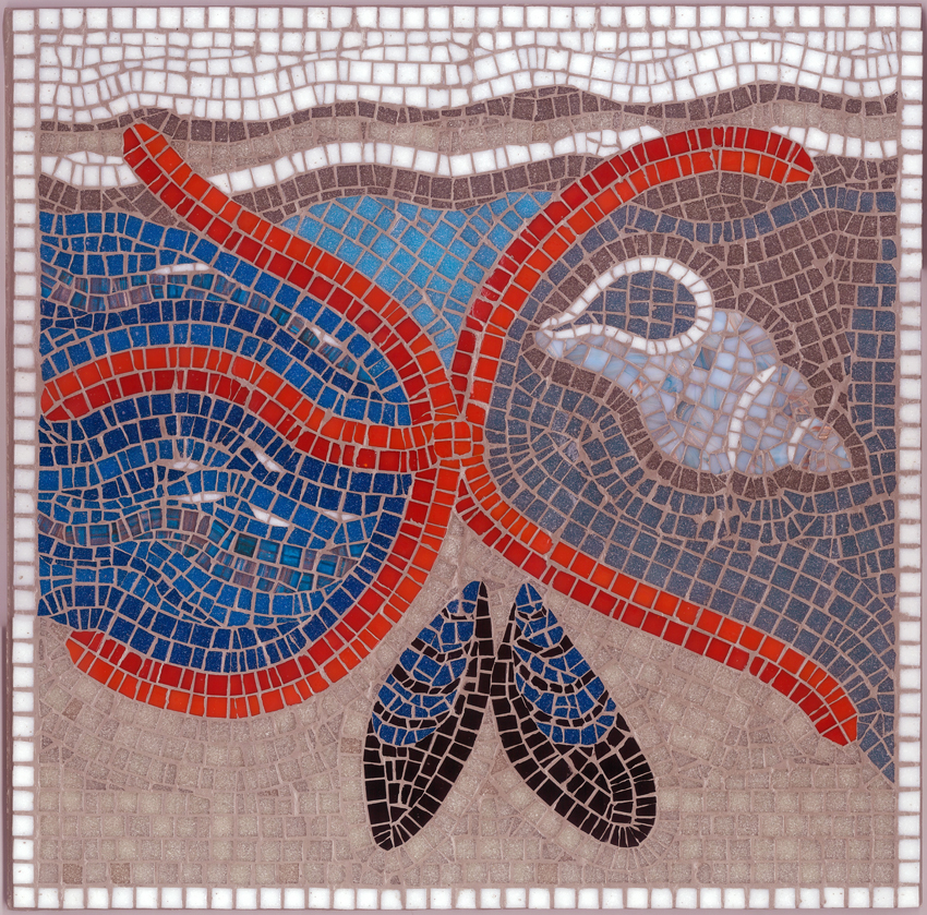
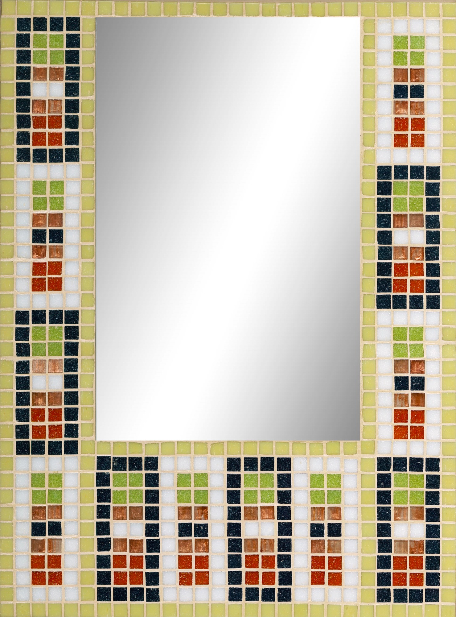
Broad bodied Chaser Dragonfly mirror
The Importance of Design
The design element of a mosaic is vital to the success of the work. This is the Chai part of Cheleq Chai as most of my artwork is derived either directly from wildlife, depicted as accurately as possible, or indirectly in the case of organic abstracts. All my artwork seeks to reflect the interconnected nature of life on this planet. This is why I chose for my logo a mosaic of a spider’s web in the colours of the rainbow. The spider’s web represents the web of life. No species exists in isolation, only in relation to other species. The rainbow hues of this mosaic spiral out from the centre, alluding to the processes of motion and energy which sustain our world.
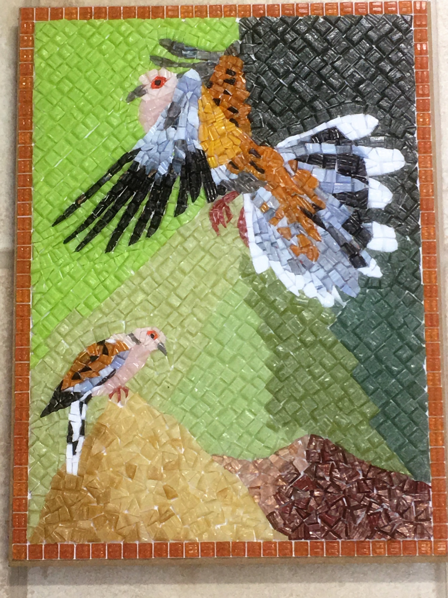
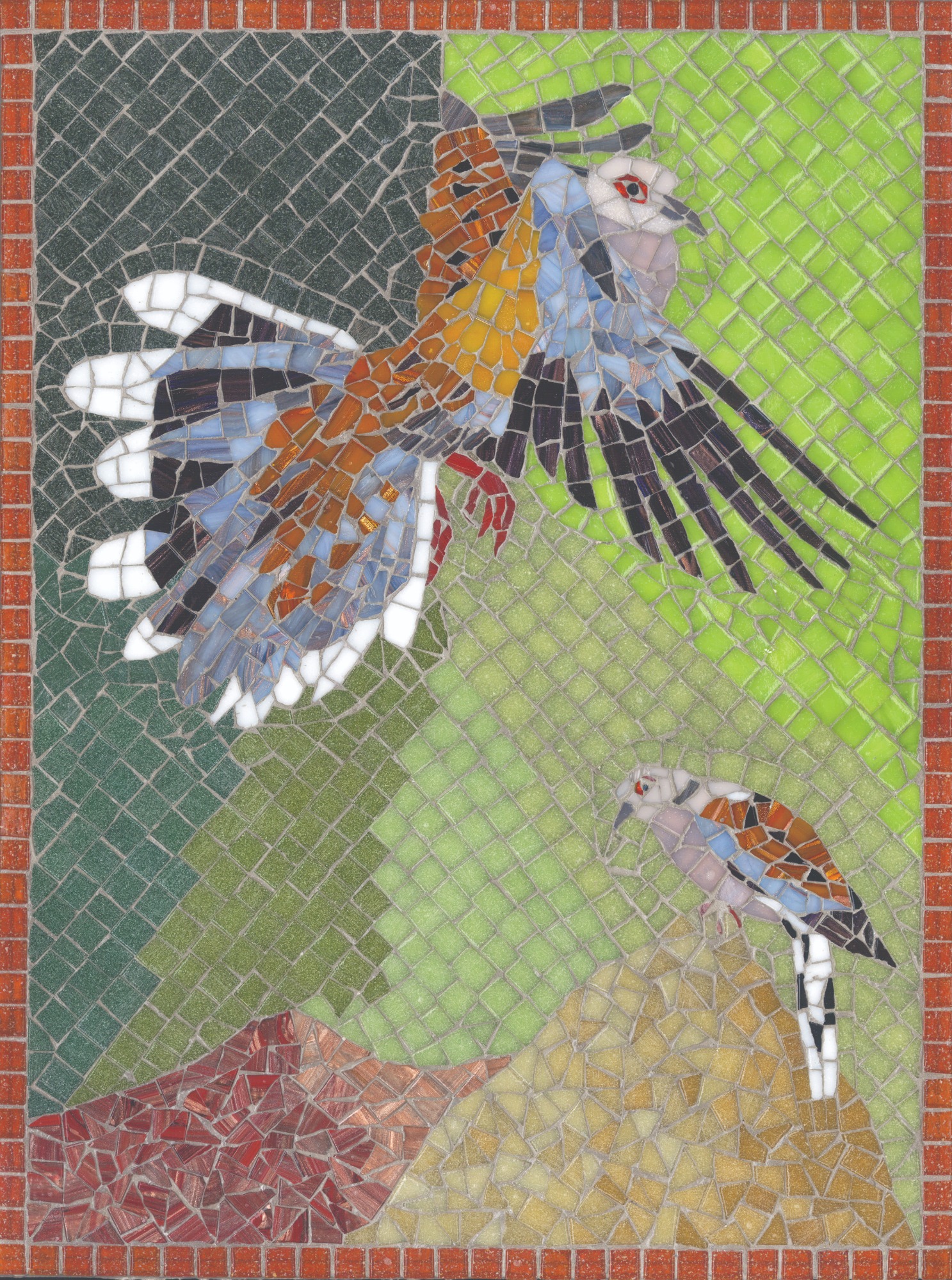
Design technique is a fusion of shape, line, colour and, in the case of mosaics, texture. The aim of mosaics is to create a work which is both good to see and to touch. Attaining visual harmony and the feeling of flow are challenges facing a mosaic artist. With glass mosaics, there is also the challenge of using colours together for greatest impact. Glass is wonderful for making bright colours sing out, yet glass can equally be used in very subtle ways, using multiple tones of similar colours to interact with the lines of grout, as in the Hoopoes picture here which includes several similar shades of pink. Subtlety in mosaic has to be balanced with strong colours, since the grout creates its own subtle effect.
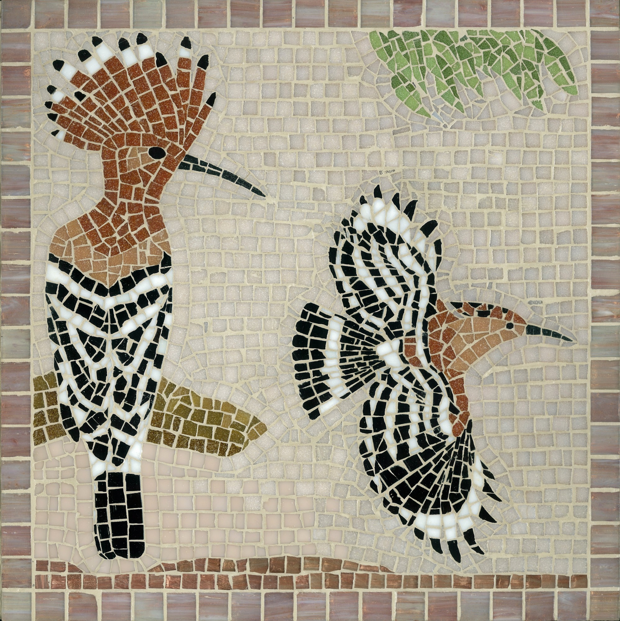
Hoopoes picture
Mosaics cannot produce imitations of life to the extent of a photograph or painting as the mosaic artist works within the constraints of the tiles and materials available. Nevertheless, the choice is vast. I possessed some 200 kinds of glass tile in many shades and in several types: translucent, metallic, iridised, and plain. I might use translucent glass to show, say, brightness of light, as in the Roe Buck mirror here, or the liquidity of water, as in the Rockpool table here. The Barn Owl picture here uses metallic glass to convey the bark of trees and the lustre of the feathers of the owl, with iridised glass for the sun’s glow at dusk. In the Whooper Swans picture here, pearly white iridised glass is used to show ice and metallic glass to show land and water. Iridised pale blue glass shows off the shimmer of the butterflies in this Toadflax and Blue Butterflies mirror.
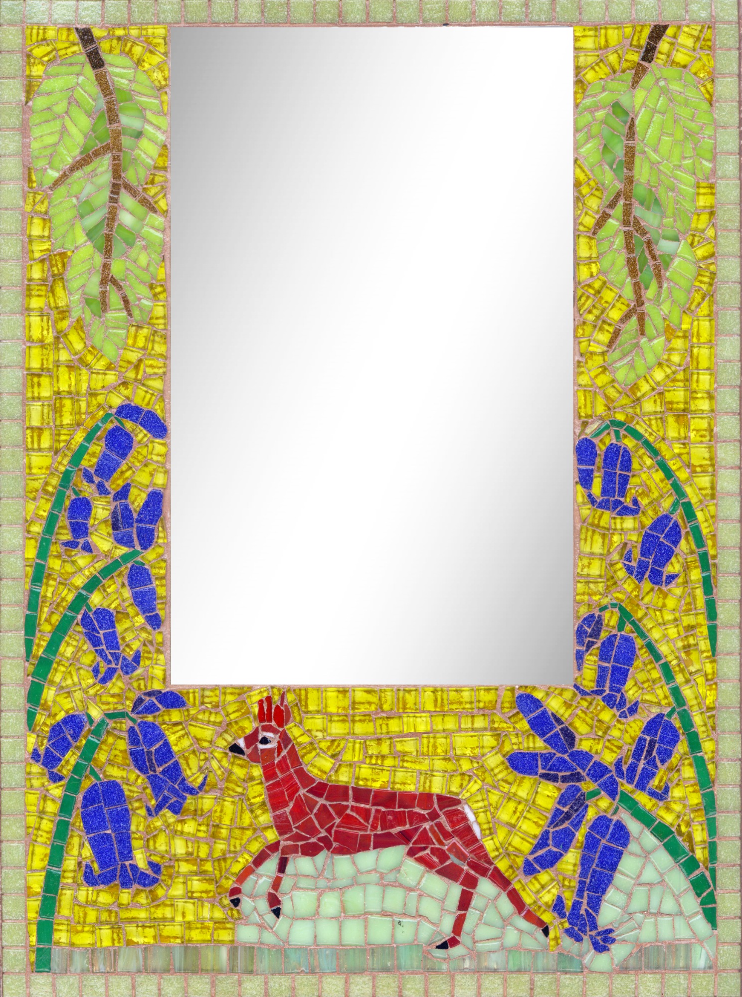
Roe Buck and Bluebells mirror
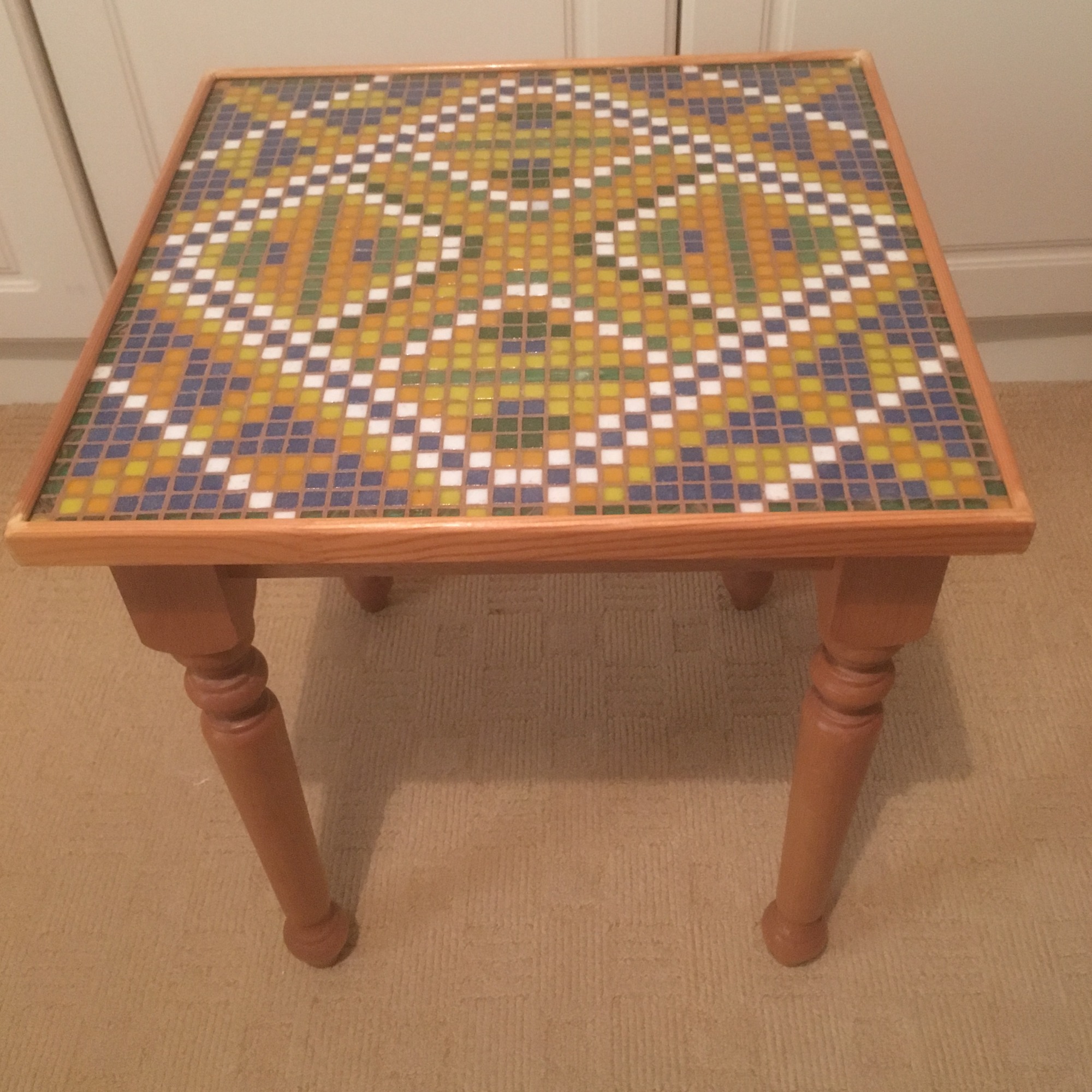
Rockpool table
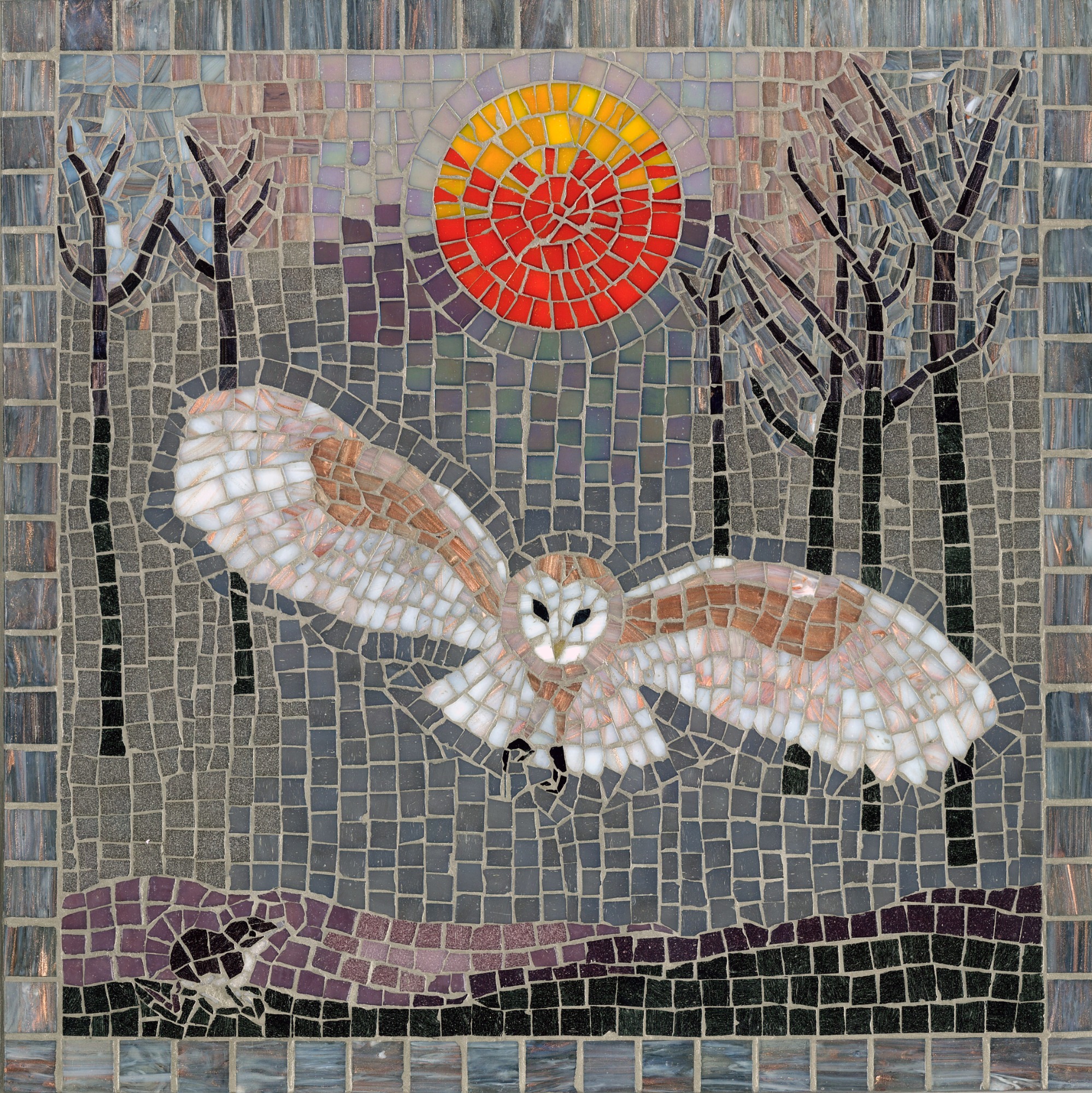
Barn Owl at Dusk picture
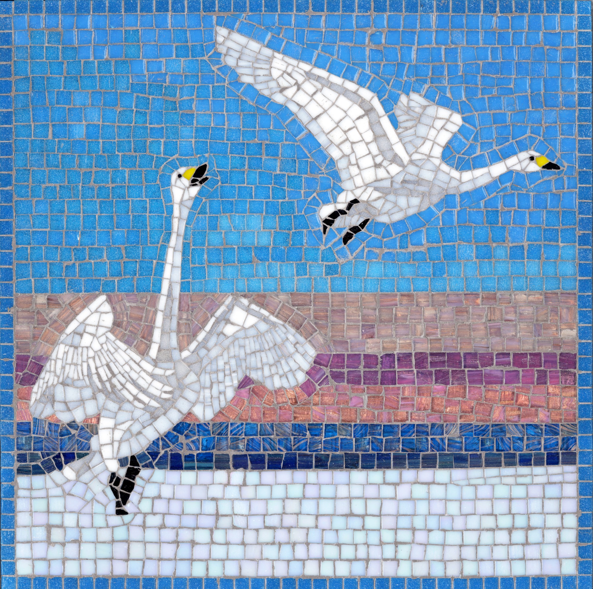
Whooper Swans picture
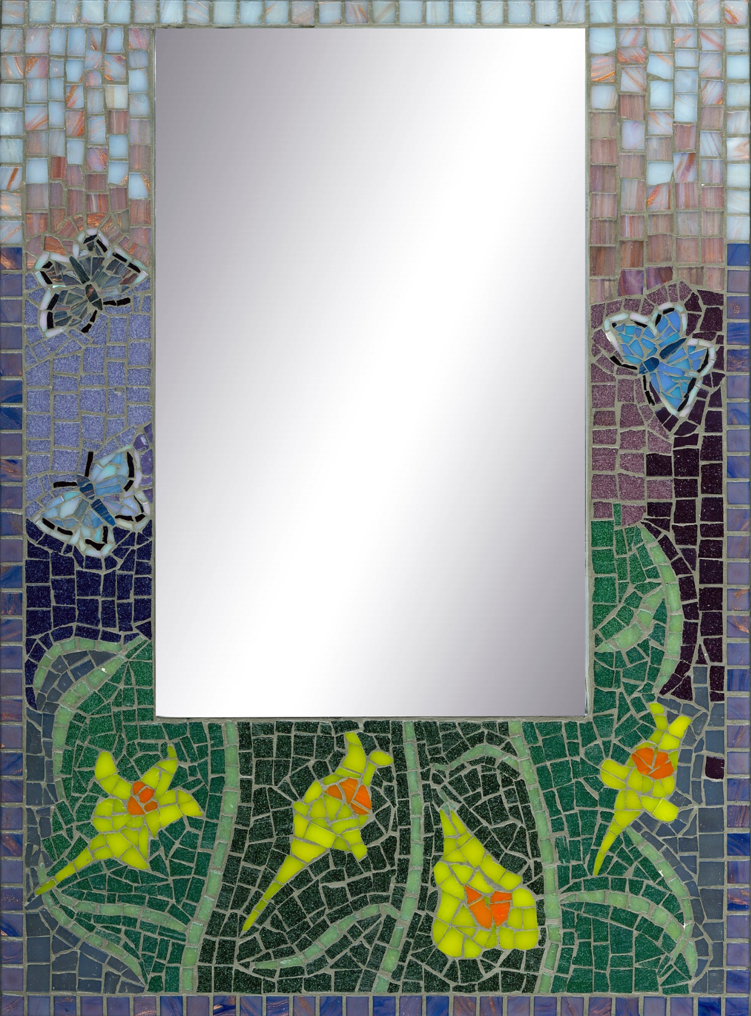
Toadflax and Blue Butterflies mirror
I used four colours of grout: Silver (pearl grey), Grey (mid-grey), Beige (buff), and Terra (reddish-brown). Other grout colours are available and mosaic artists can mix their own grout colours to suit by adding pigment. The colour of grout that I used was chosen to complement the tones in the glass used.
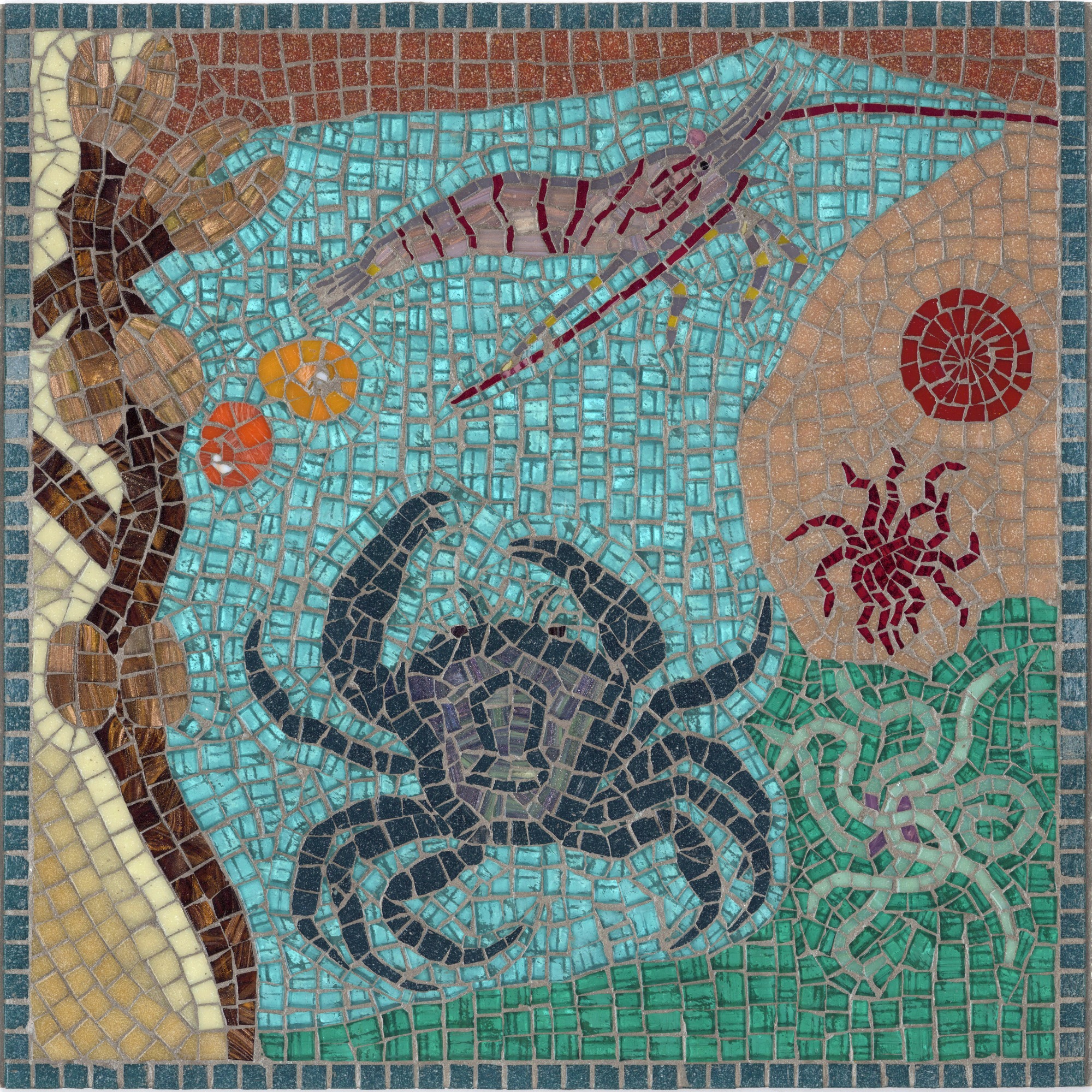
This visual-textural nature of mosaics means that the grout also serves the design. The flow of the grout - vertical or horizontal or diagonal – can be utilised to great effect to suggest, for example, the expanse of the sky in the Portland Bill and Lobster picture here or the height of a tree or even rain falling. In the River Table here, the vertical grout flow accentuates the cascading water and the depth of the water around the salmon. Grout flow can give drama too, as in the Kingfisher Diving picture shown here, where the vertical flow conveys the speed of the plunge. Grout and glass work in tandem.
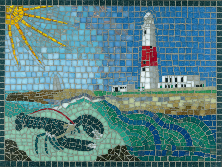
Portland Bill and Lobster picture
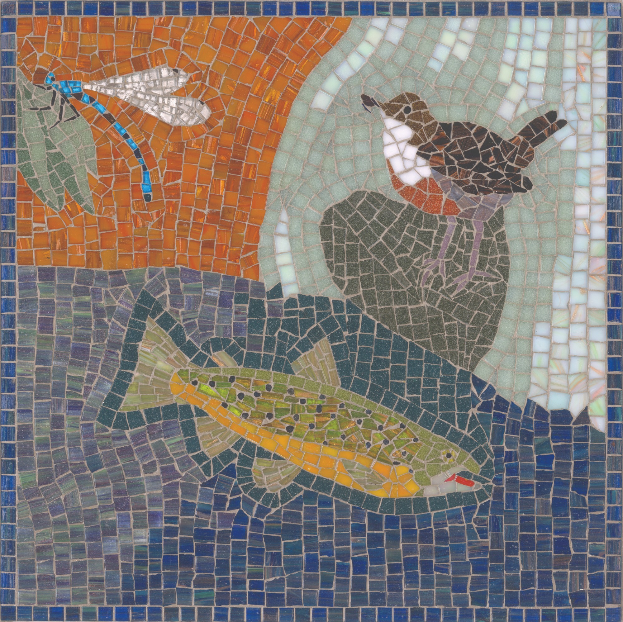
River Table
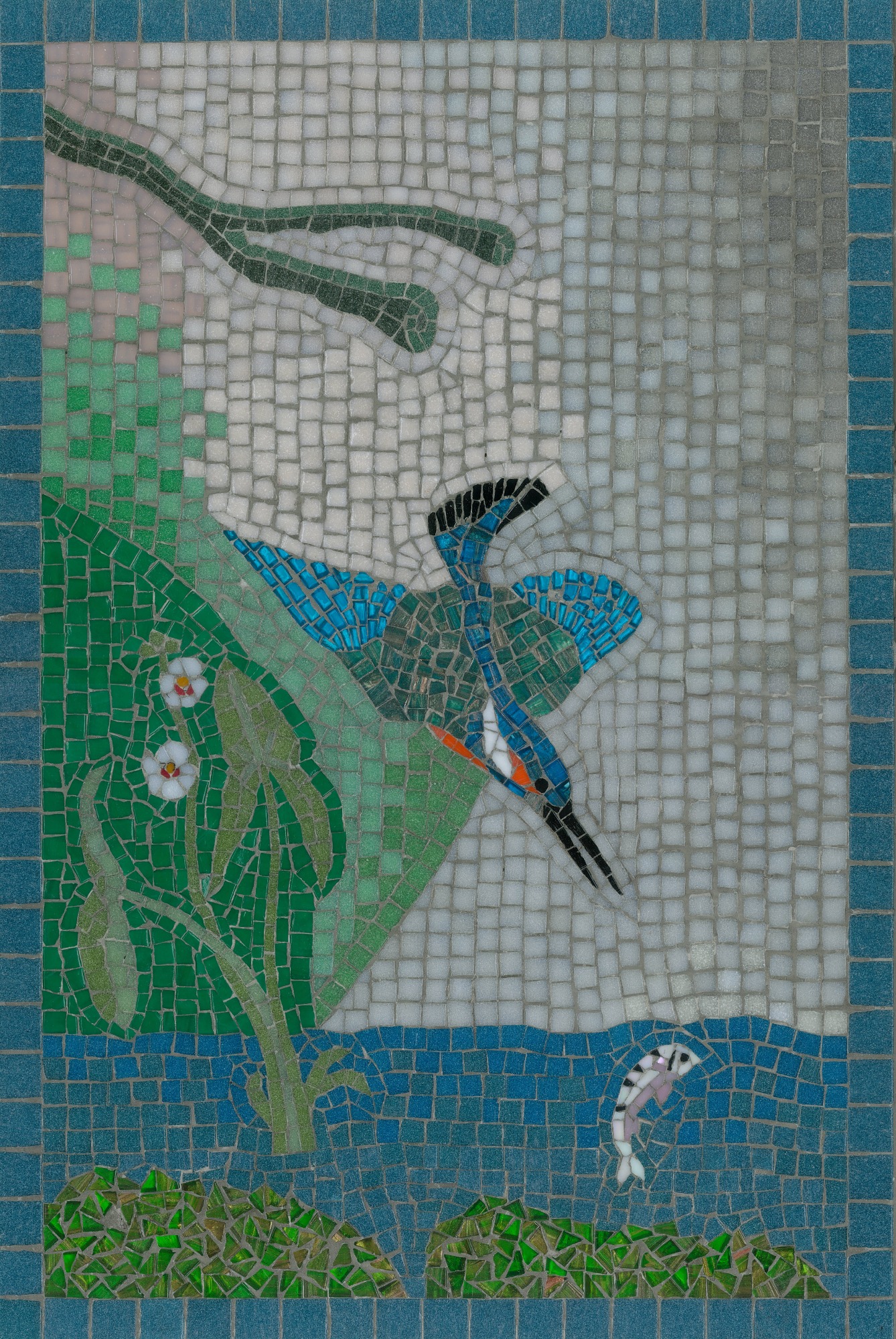
Kingfisher Diving picture
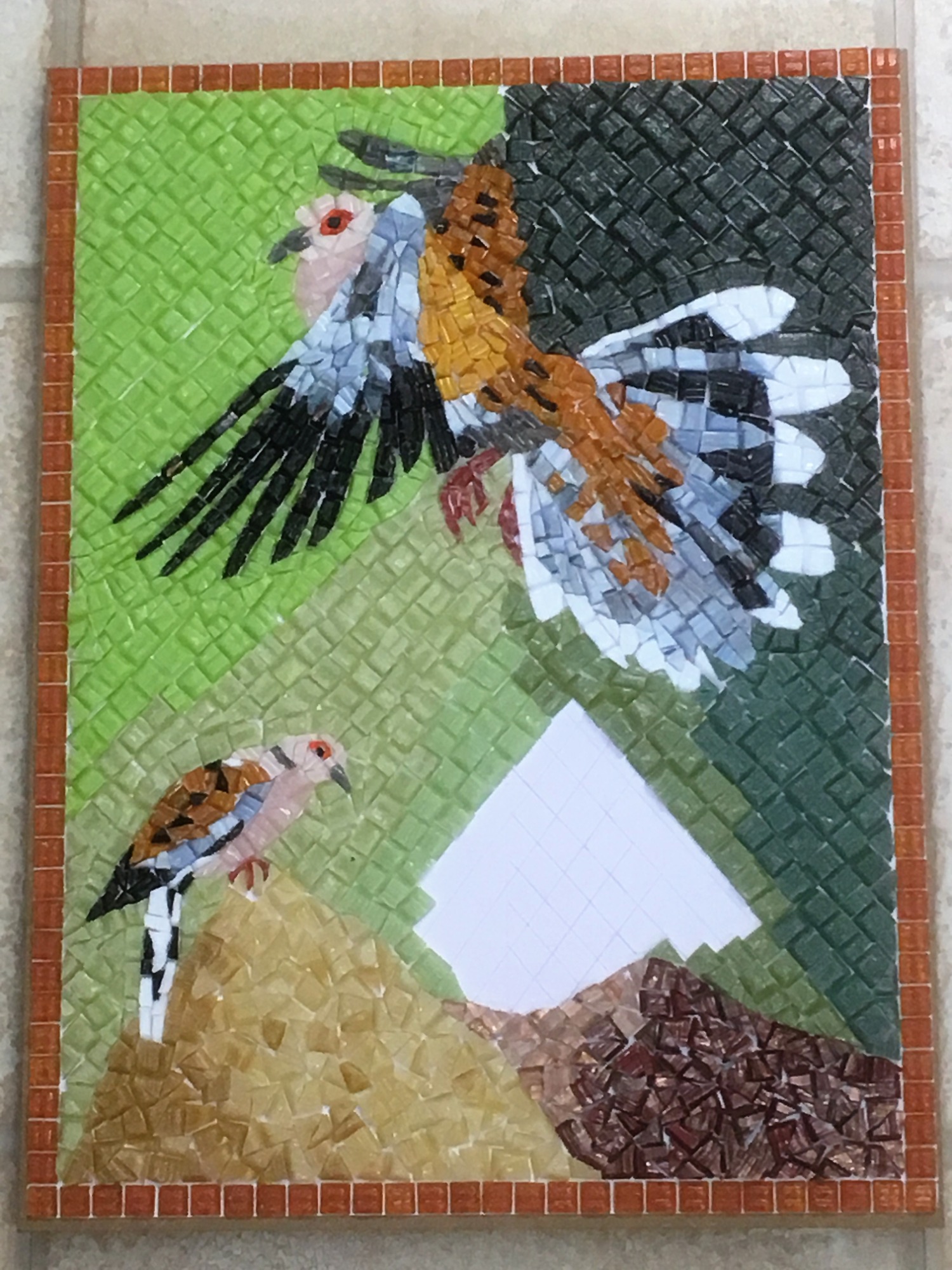
Yet another possibility of achieving visual-textural impact lies in the way in which the glass is cut. So, for instance, I would use triangles and jagged asymmetric pieces of glass to portray the roughness of rock, as shown here in the Turtle Doves picture, or the spikiness of the Teasel plant in the Goldfinches picture.

Turtle Doves picture
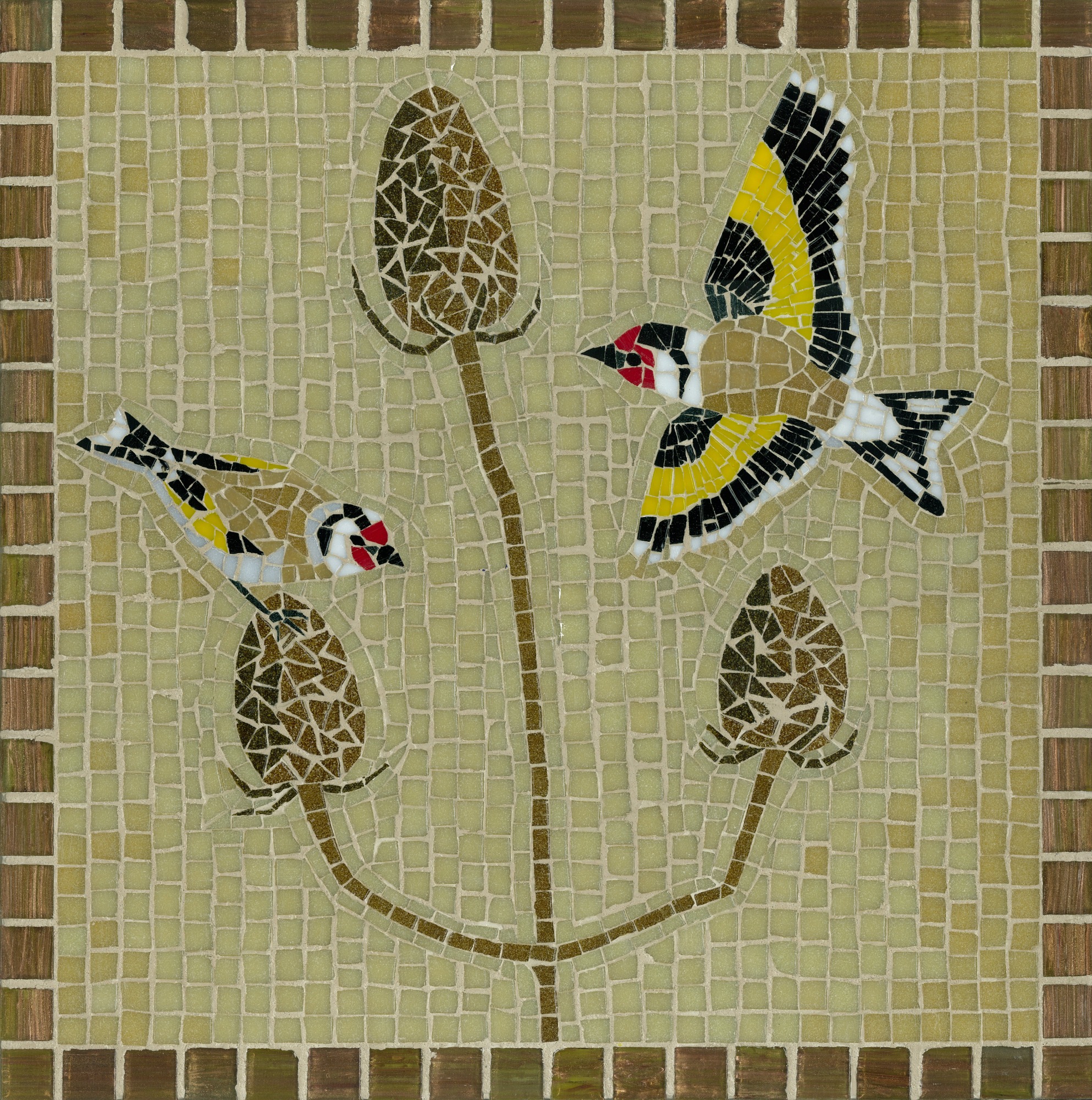
Goldfinches and Teasel picture
Generally, I cut tesserae as small squares or rectangles or pie-slice wedges, sticking their straight edges on the line which I had drawn on the paper design. On other occasions, I would cut glass into a circular or elliptical shape, as in the Golden Oriole’s eye here, or into fine lines for whiskers or claws or antennae such as in the Mayflies picture here.
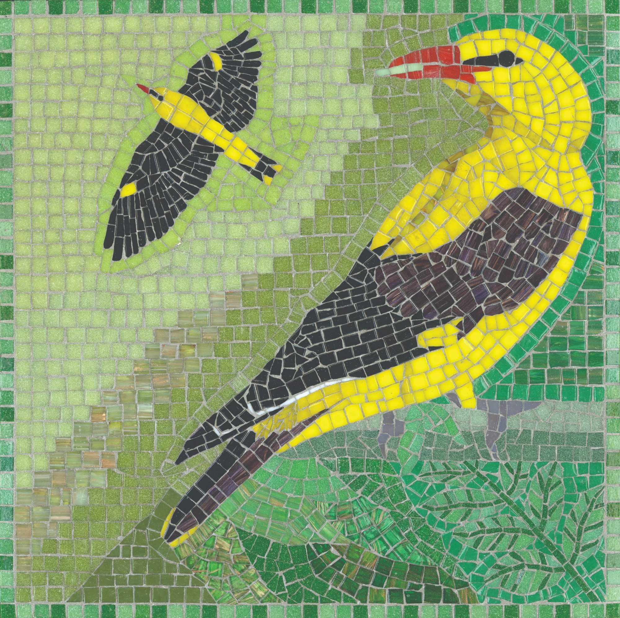
Golden Orioles picture
Mayflies and Water Crowfoot picture
Abstracts and Patterns
I also enjoyed creating semi-abstract mosaics and geometric-patterned mosaics in glass.
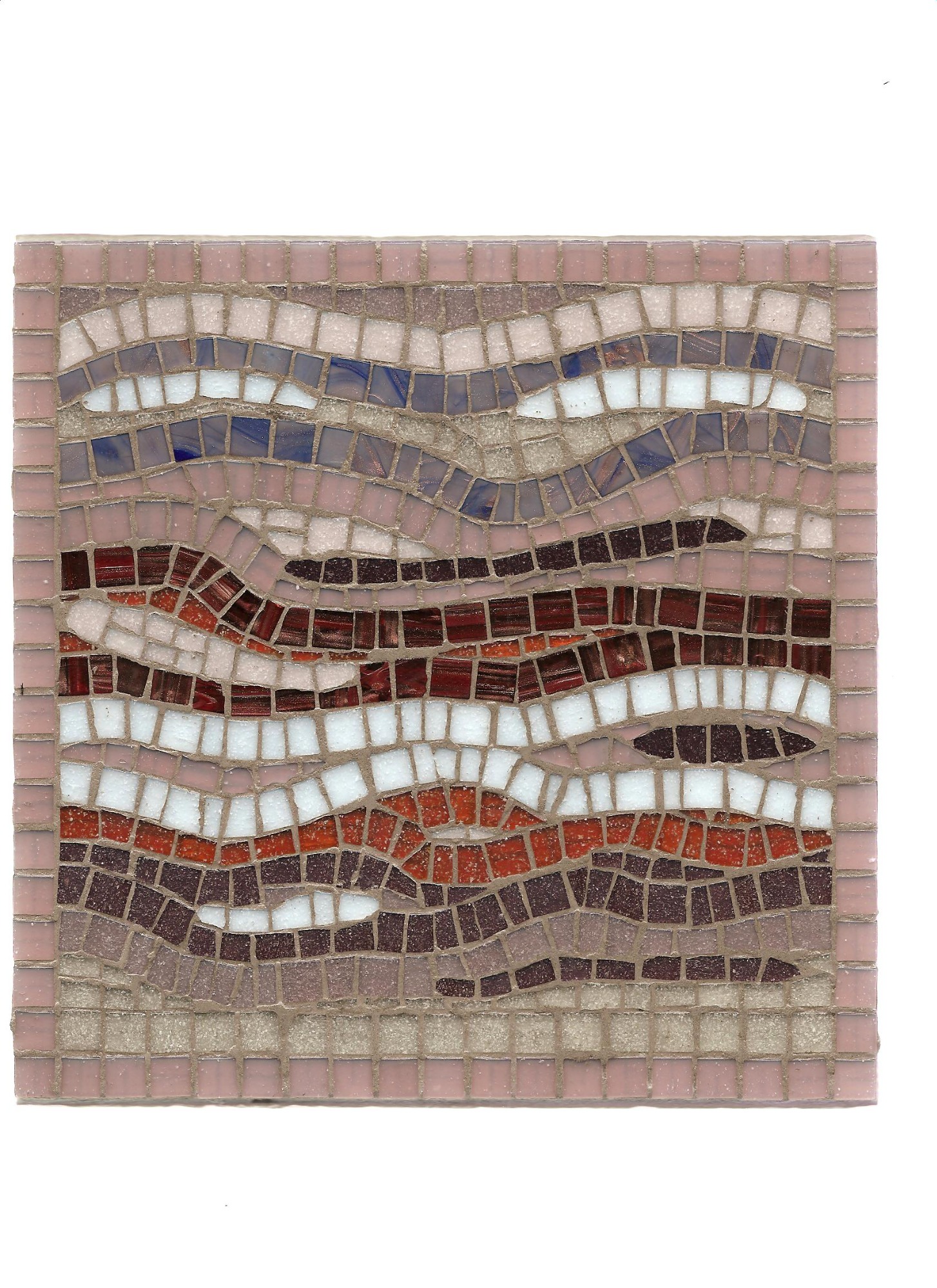
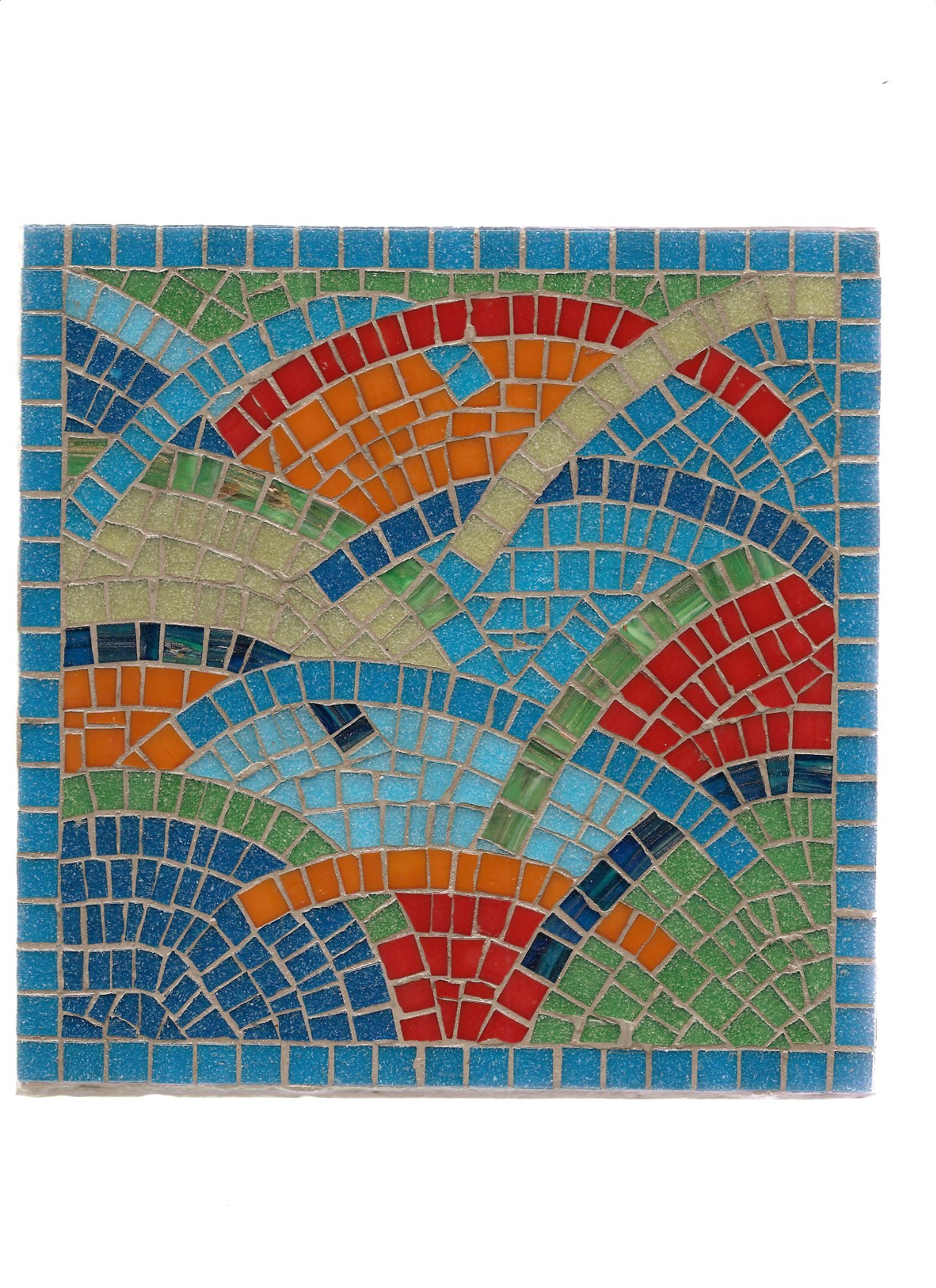
The semi-abstract mosaics were based on organic forms and allowed me more freedom in design. I produced five ranges of these abstract organics. The Zoë pictures and mirrors related to the sea and depicted waves or plankton. Waves make lovely curved lines, as in the Lipsi and Paxi pictures here. Plankton have interesting shapes and tremendous importance, despite their minuscule size, since they lie at the bottom of the food chain. This Kimolos mirror shows foraminifera.
Lipsi picture
Paxi picture
Kimolos mirror
The Pharos range of tables were also inspired by the sea in that each was drawn from a place in the Shipping Forecast. Hence the Dover table here.
Dover table
The Sylvia range related to botanical forms, as shown here with the Bourgeon mirror (the hickory tree) and the Zeste mirror (citrus fruit).
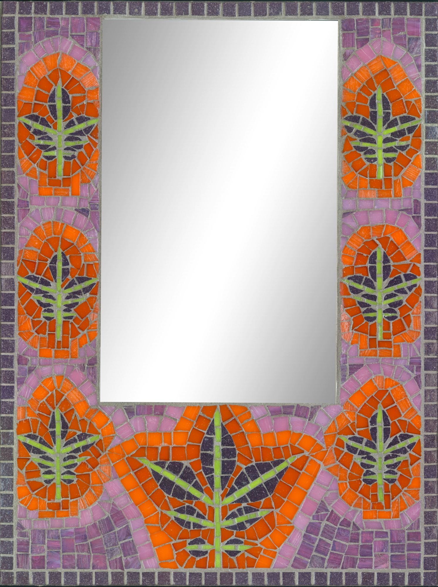
Bourgeon mirror
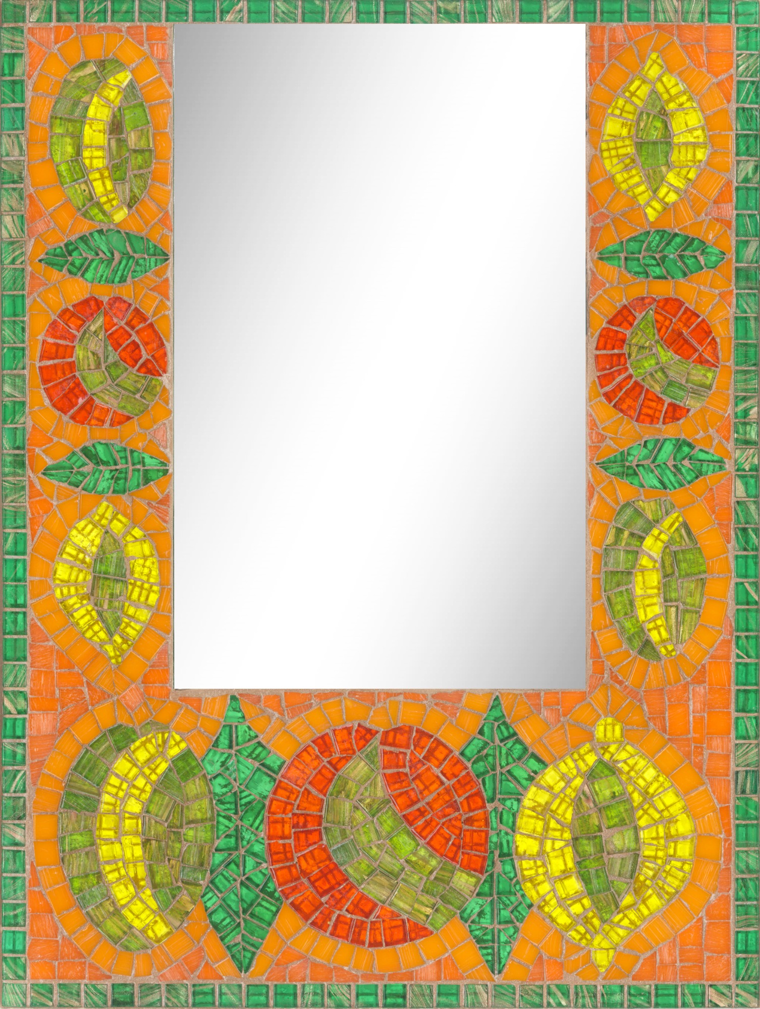
Zeste mirror
The Aeonia range depicted animals with reference to ancient themes, like the Tigerjet table here, while the Elsa range focused on the illegal exploitation of animals by arms traders and other criminals – see the Elephant and Shark pictures here.
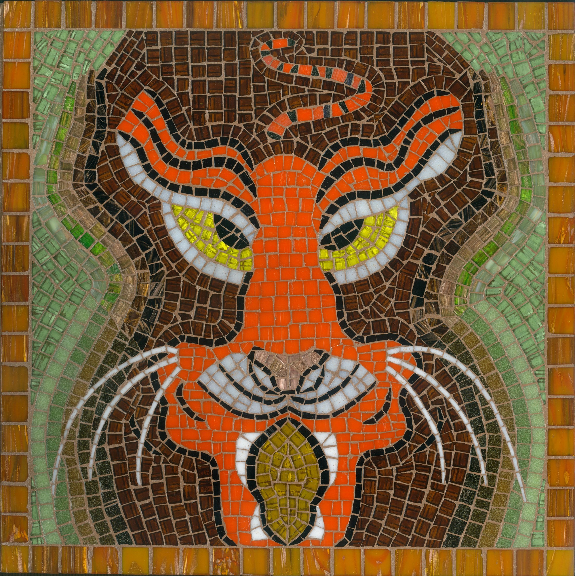
Tigerjet table
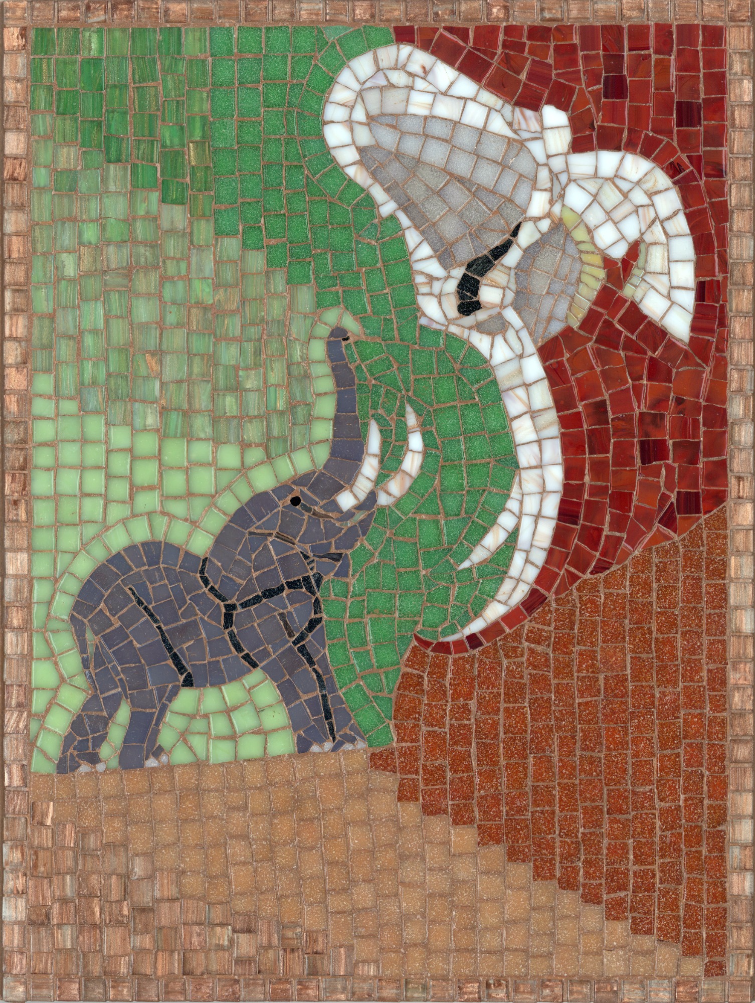
Elephant picture
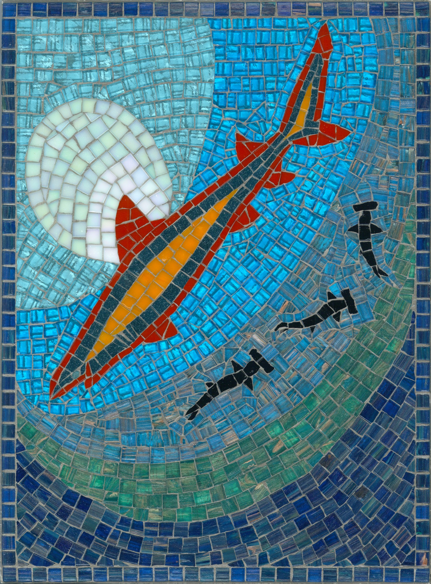
Shark picture
For the geometric-patterned mosaics, I used two types of ready-cut vitreous glass tile. It was fascinating to follow through sequences of pattern. My Vivid Glass and Jewel Glass mosaics used glass tiles 15 x 15 mm square x 3 mm thick: the Vivid Glass in rich translucent colours and the Jewel Glass iridised in dreamy lustrous shades; 32 shades in all. See the Majesty and Daybreak mirrors here.
Majesty mirror
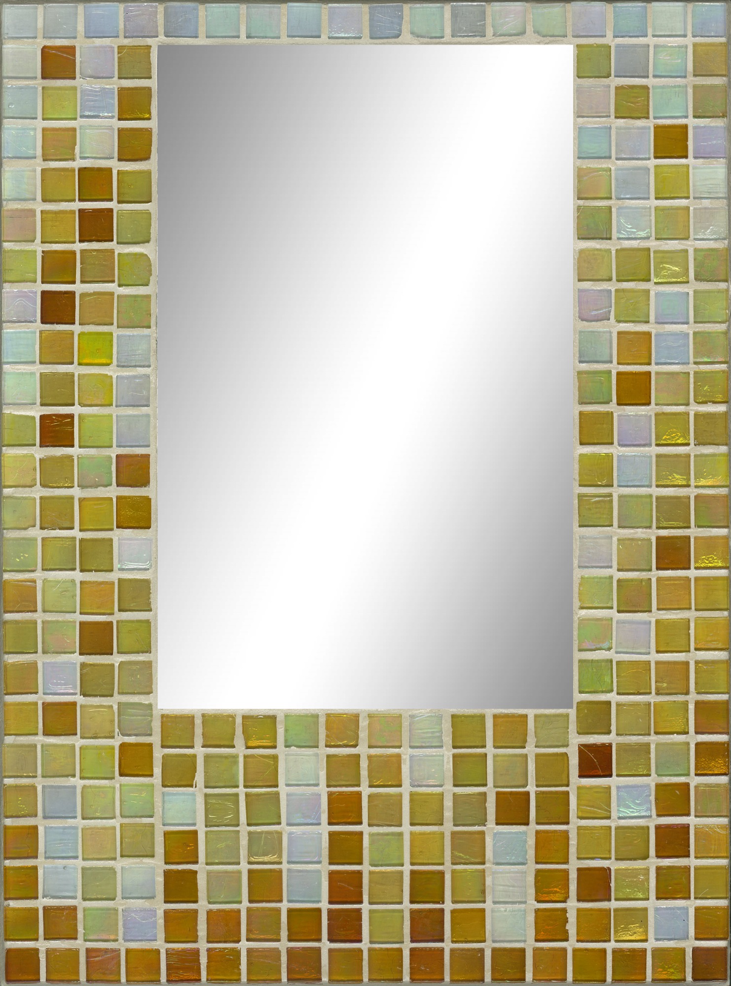
Daybreak mirror
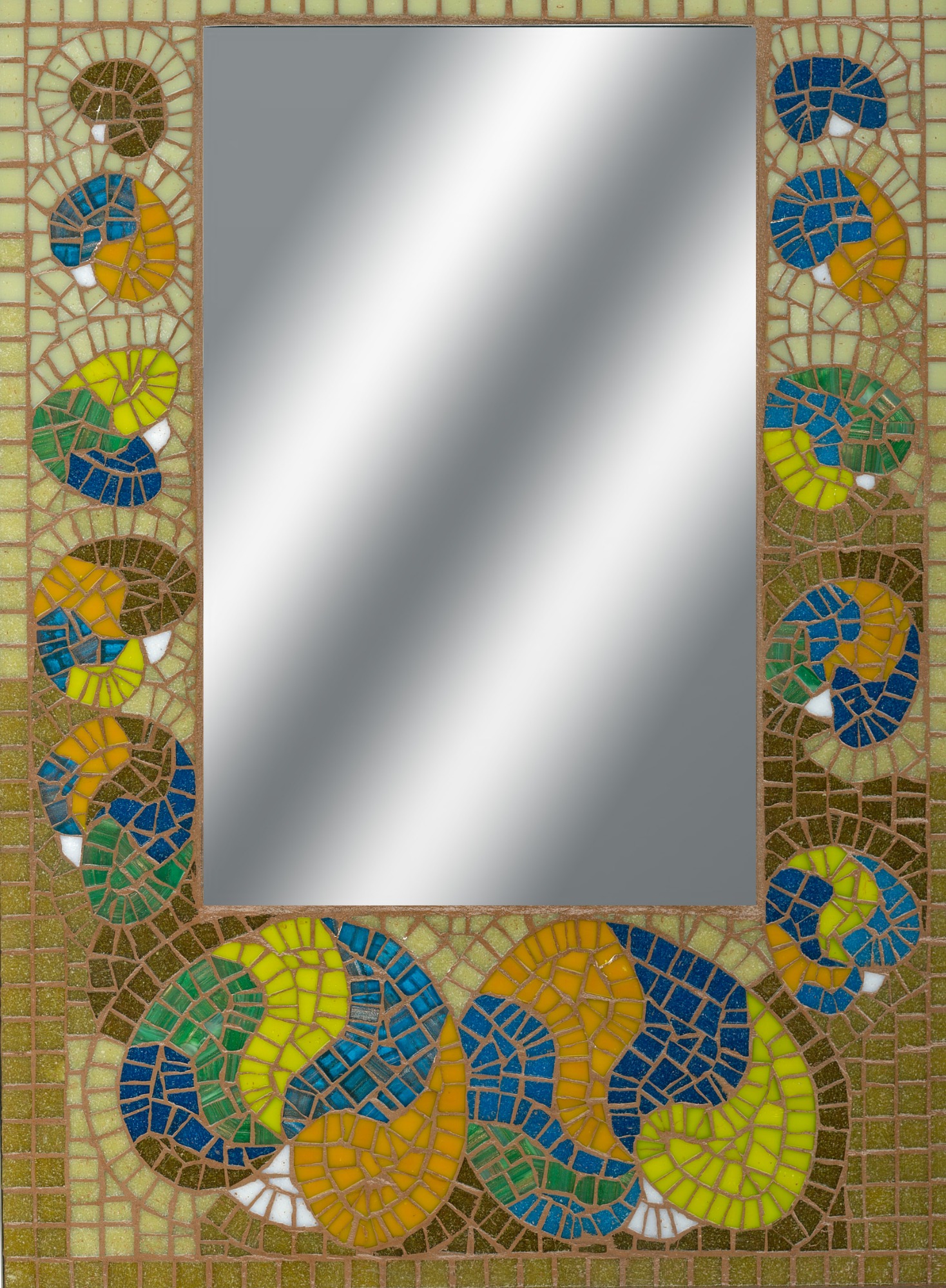
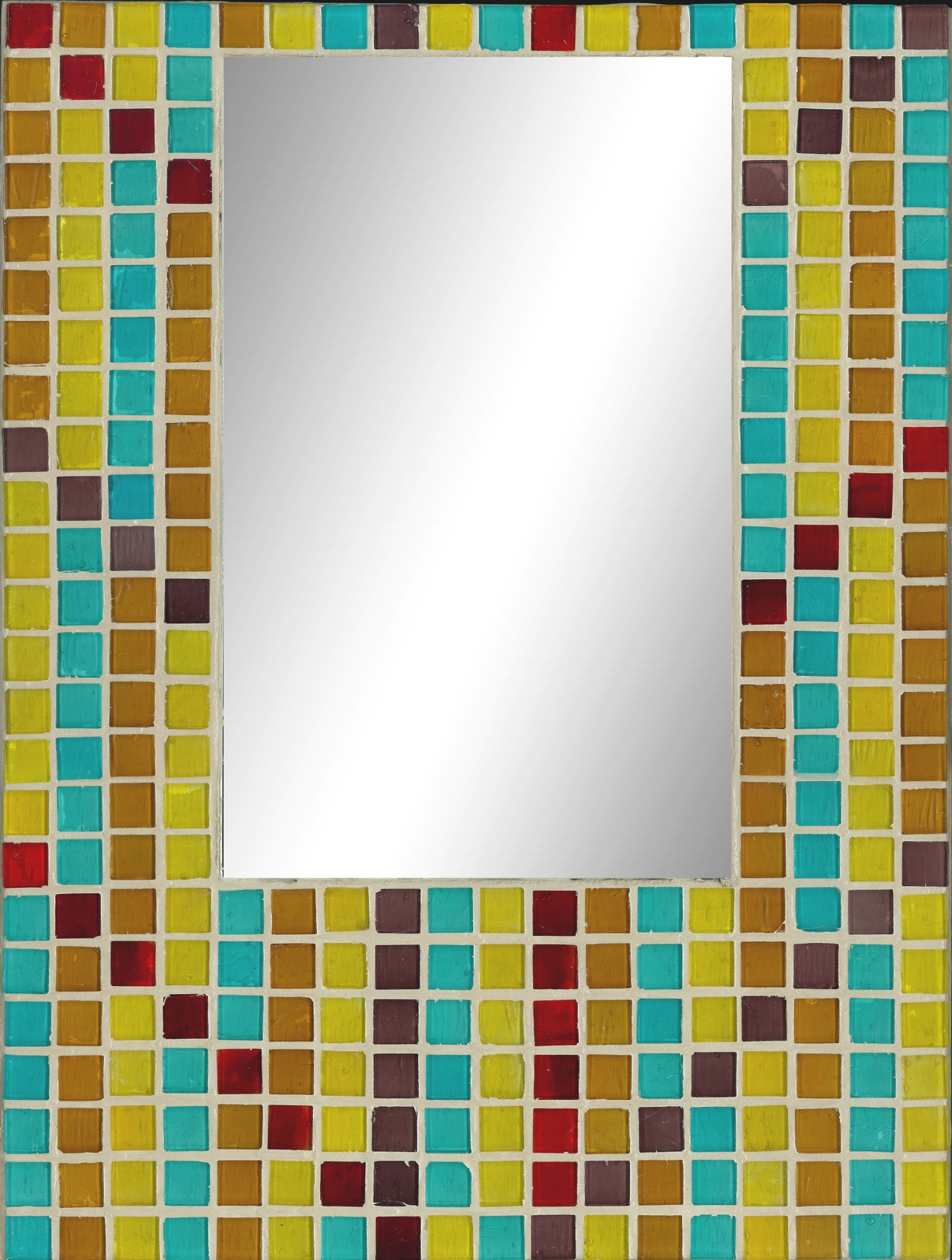
The other ready-cut vitreous glass tile – my Atlantis Glass range – used a wide variety of small glass tiles 10 x 10 mm square and 3 mm thick, in plain and metallic shades; 60 shades in all. They gave me great scope with making patterns, as in the Daffodil table and St Erth mirror here.
Daffodil table
Daffodil mosaic
St Erth mirror
The Process – My Mosaic Story
The story of how I came to make mosaics, with full details of my techniques and discussion of artistic design, is recounted in the illustrated booklet, ‘My Mosaic Story’, which is available for purchase in addition to my artwork.
I was largely self-taught. I practiced and developed my techniques for crafting mosaics over 20 years: for a decade as a serious hobby and for another decade as a professional mosaic artist.
My mosaic story began in 1996 at Missenden Abbey in England with an intensive week’s course, taught by Emma Biggs of the London Mosaic Workshop. There I learned to draw a design on paper, cut to the size of a piece of medium density fibre board (MDF); to cut vitreous glass tiles with tile nippers; to stick the glass tesserae onto the lines of the design; to mix grout and tile adhesive; to grout the glued tesserae onto the paper design; to spread the adhesive on the MDF board; to lay the grouted design face first onto the board with adhesive; to soak the paper and peel it off the glass tesserae; and to regrout it after the finished mosaic had dried out. This was the indirect or reverse method as taught by Emma.
I preferred this indirect method over the direct method of mosaic-making. One reason was that the mosaic had a clean, smooth finish. The ‘rough’ side of the glass tesserae was uppermost on gluing as the smooth side of the glass was stuck onto the design; hence the smooth side of the glass came to light once the paper had been peeled away.
Another reason why I preferred the indirect method was that I had complete control over the tesserae by gluing them to the design, so I could use very tiny fragments of glass and create precise detailed designs with finesse. This was because the PVA glue held the tesserae firmly until the glue was wet. See the Sunflower Host table here.
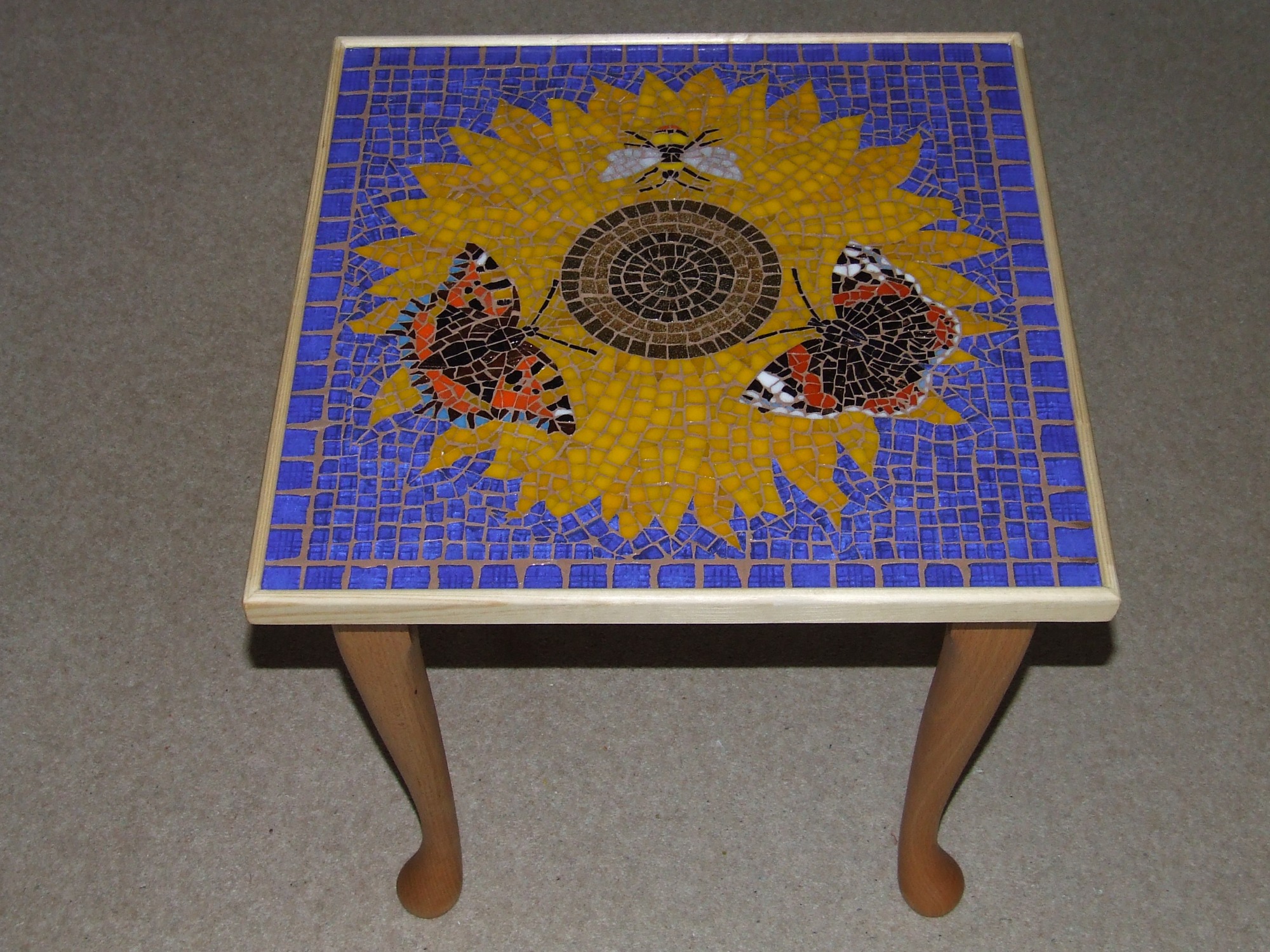
Sunflower Host table
I could also unpick and re-glue the tesserae if necessary, so the sticking stage was methodical and unhurried. One enormous advantage was that I could work for short periods at a time, rather like picking up and putting down an embroidery. Of course, the indirect method is unsuitable for large mosaic works, murals or pillars, which can only be made directly.
A third reason for preferring the indirect method was that the mosaic had a smooth, two-dimensional surface and could therefore be scanned digitally to provide a perfect image. Subsequently, I used the digital images to produce greetings cards, gift wrap and gift cards.
The result of reversing the mosaic is demonstrated in these images of the Frog and White Water Lily picture. Notice how the element of grout tones down the colours of the glass.
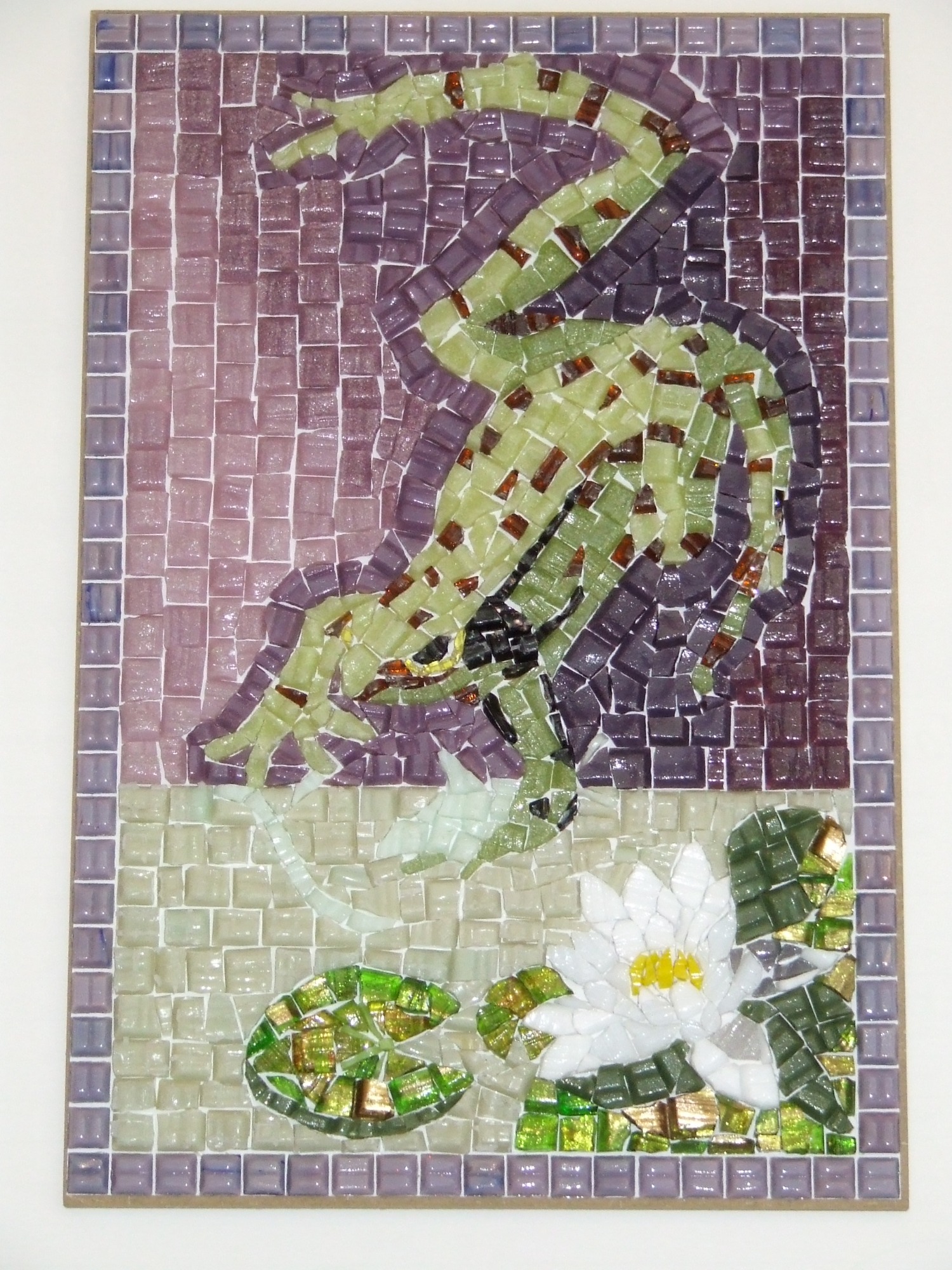
Frog and White Water Lily picture – UNGROUTED
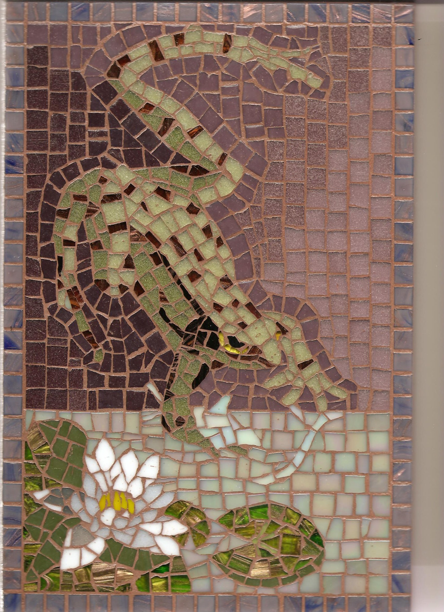
Frog and White Water lily picture – GROUTED
New Techniques
But when I came to start my mosaic business in 2007, making glass mosaic pictures, mirrors and table tops, I encountered some practical problems: problems such as the thickness of standard MDF board, the risk of misaligning the grouted design on the board at the crucial mounting stage, and the aforementioned issue of the ‘dirtying’ effect of the grout behind the glass.
I therefore devised ways around these problems – with my father Michael’s practical expertise in carpentry and materials. I switched to using Medite board for mounting. This is a 6 mm thick type of refined medium density fibre board which is good for signboards. This strong, thin board facilitated framing and edging the mosaics, and also made the mosaics much lighter in weight than with the standard 12 mm thick MDF board. I had the Medite boards cut to five specific sizes, from the smallest 200 x 200 mm tile boards up to the largest 600 x 400 mm panel boards. I further protected the boards with MDF sealer.
I also facilitated the process of cutting the paper for the design by using specially cut steel templates in the five sizes of the boards, but fractionally smaller. I could then simply run a stanley knife around the edge of the template to cut the paper. The size of the paper had to be precisely accurate, to fit just within the edge of the board – allowing a little flexibility on mounting, yet avoiding a noticeable gap of board around the mosaic. And whereas during the hobby period I had used brown parcel paper for my designs, now I used white paper which was strong enough to withstand mounting, yet thin enough to allow the water to penetrate when peeling the paper off the mosaic. Plus, white paper made it much easier to draw the design and to see the lines.
My father crafted mounting boards and wooden blocks, to ensure the grouted mosaic was aligned correctly on the adhesive, and I learned to clamp the ‘mosaic sandwich’ of grouted mosaic between its backing board and the board spread with adhesive. By clamping, I could safely reverse the mosaic – vital with large panel mosaics. I could then remove the backing board from the design, leaving the paper exposed on top, and soak the paper in order to peel it. In time, I turned to dabbing white paint on the glued design before grouting, a procedure which transformed the brightness of the finished work. I further enhanced the brightness of the glass by applying two coats of transparent ceramic glaze.
Mosaic-making is all or nothing! Once the design is on the adhesive, it is very difficult to adjust it. So, the mounting stage was the critical point at which the mosaic might fail through misalignment - weeks or months of work wasted!
The Procedure for Mosaic Making
This was the procedure in a nutshell:
(1) Drawing; (2) Cutting; (3) Whiting; (4) Grouting; (5) Mounting; (6) Regrouting; (7) Glazing; (8) Framing; (9) Oiling (in the case of tables) and Painting (in the case of pictures and mirrors).
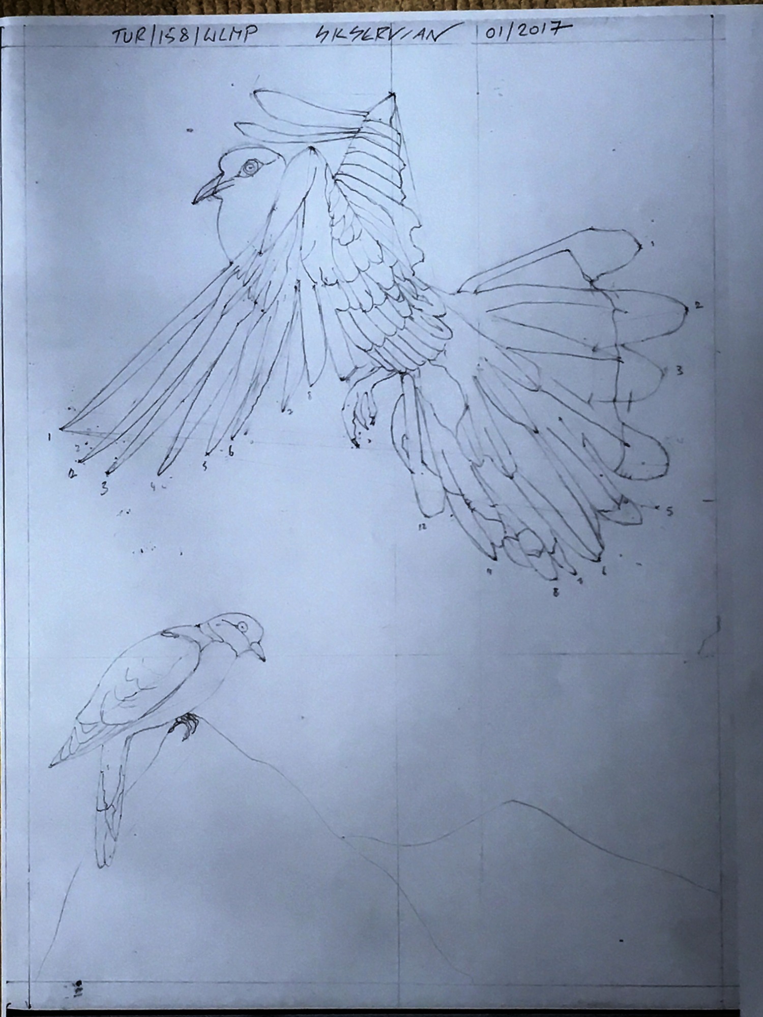
Turtle Doves – 1.DRAWING STAGE
Turtle Doves – 2.CUTTING STAGE
Turtle Doves – 3.STUCK, PRE-WHITING STAGE

Turtle Doves – 4.MOUNTING STAGE
Turtle Doves – 5.REGROUTING STAGE
Turtle Doves – 6.GLAZING STAGE
The framing and edging stage was performed either by my father or a professional picture-framer. My mosaic tables were assembled by my father from legs and frames supplied by a furniture producer in Hertfordshire, and I oiled the wooden pieces before assembly. In the case of pictures and mirrors, I painted the edges and back of the mosaics to smarten them up.
After all this time and effort, the finished mosaic work was indeed a piece to be proud of – hopefully, as mistakes could not be rectified! It was also satisfying to produce an artwork so durable, and made with ecologically friendly materials. This mosaic-making procedure is at heart beautifully simple and low-tech, involving humble tools: pencil, rubber, craft glue, tile nippers and, to me, indispensable, dental probe for positioning and sticking the tesserae.
The Studio on Portland
I operated my mosaic business from a studio in the garden of my father’s house on the Isle of Portland, off the south coast of England – Portland is a place in the Shipping Forecast for the British Isles, as provided by the Met Office. I worked amid nature, surrounded by the shifting sea of the English Channel at the point where it opens out to the vast Atlantic Ocean. Portland Bird Observatory nearby, in the Old Lower Lighthouse at Portland Bill, records migrating birds, moths, butterflies and other wildlife, so nature and the sea were a wellspring for inspiration.
I chose the name Chesilisk Mosaics and Tiles for my business and made a mosaic for the logo: simply the map of Portland on its side. The island then looked like a monster’s head, with conveniently situated quarries for its eye and nostril – Portland is famous for its stone and the entire island is pitted with quarries. ‘Chesil’ refers to Chesil Bank, the spit of shingle which connects the island to the mainland of Dorset; ‘chesil’ means ‘stone’. Portland is also part of the Jurassic Coast, where dinosaurs once roamed: another reason for the monster motif.
Chesilisk Logo
** ** **
4438
PHOTOGRAPHY
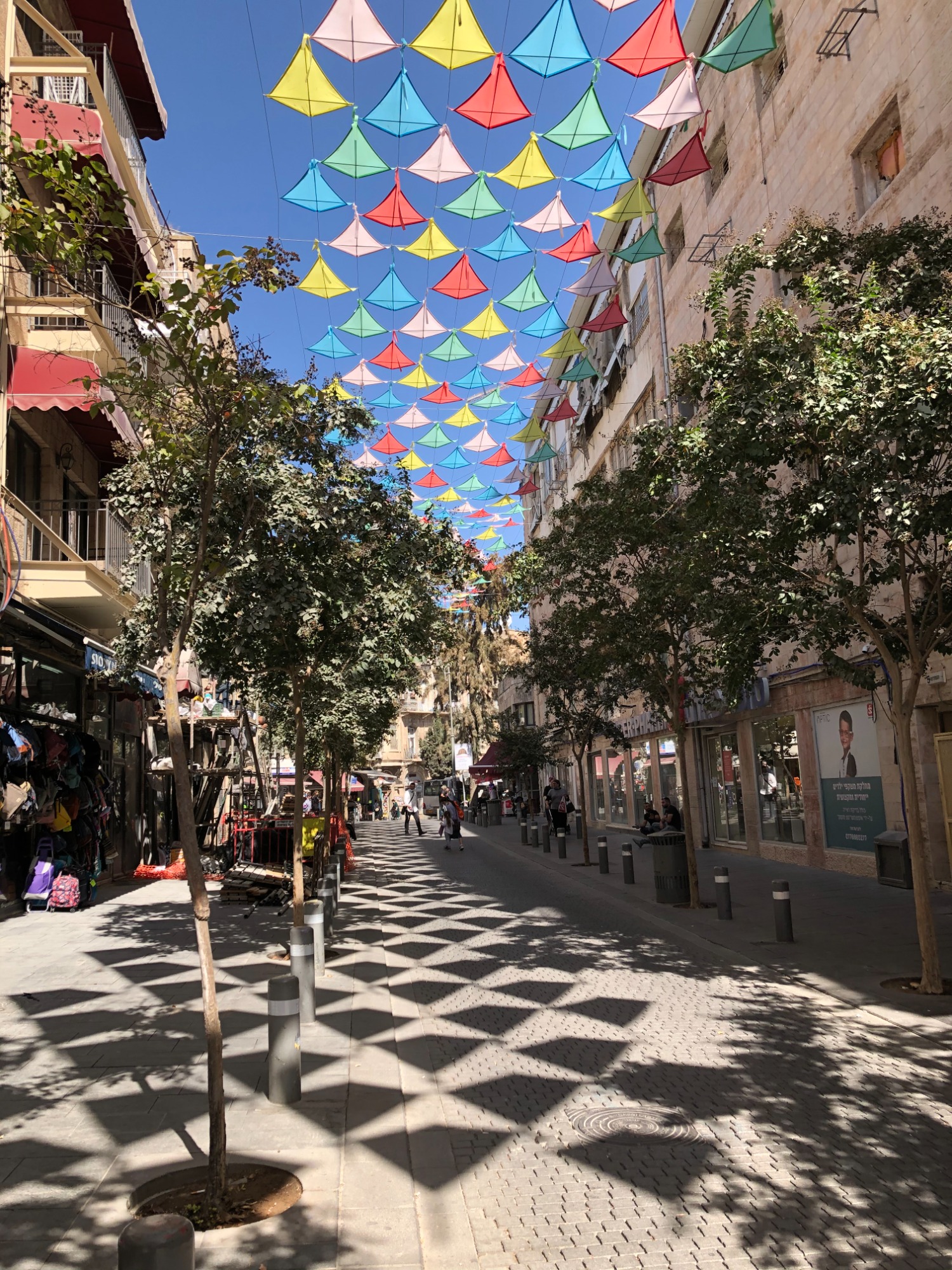
I began taking photographs spontaneously when out walking, either in Israel, especially Jerusalem, or in England, on the Isle of Portland and the surrounding countryside of West Dorset. Capturing the moment quickly became a passion, evoking my fascination for nature, the interplay of light and shadow, and the energy of street scenes.
Jerusalem changes constantly. Buildings are constructed, parks are renewed, new trees and flowers planted along its streets. Jerusalem is a bustling metropolis as well as a green city which manages to remain intimate, despite its urbanisation and expansion. This mesmerising city I now call home.
I keep returning to the Isle of Portland, my former home. This island, its adjoining town of Weymouth and the West Dorset coast attract many holidaymakers. There the sea incessantly shifts in hue and texture according to the light, wind, and weather. Portland is a smallish island which stands up high; an island which feels isolated, yet is not a true island since it is joined to Weymouth by a spit of shingle known as Chesil Beach. Chesil Beach runs on west for 18 miles, its pebbles gradually diminishing in size, as far as West Bay, near the old rope-making market town of Bridport. For much of its length, Chesil Beach is separated from the mainland by a brackish stretch of water called the Fleet Lagoon, which is a magnet for birds. Hence the medieval swannery at Abbotsbury, once the site of an eleventh century Benedictine monastery and now a tourist attraction. This West Dorset coast is also termed the Jurassic Coast after the geological era in which its rocks were formed, and Portland is famous for the quality of its limestone. Portland’s many quarries, both working and disused, have become hollows of wildlife. The lighthouse at Portland Bill looks out across the vast Atlantic Ocean with no landfall before South America. The mystique of distance helps enhance Portland’s aura of grandeur, wildness, and charm.
3256
** ** **